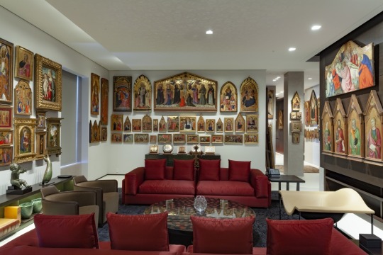
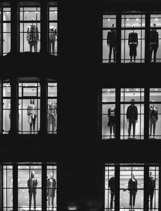
Museum De Fundatie, dat de afgelopen tien jaar onder de bezielende leiding van directeur Ralph Keuning een sterke groei heeft doorgemaakt, is normaal gesproken een plek waar je in stille zalen zwijgend voor schilderijen staat. Maar afgelopen maanden was het daar veel luidruchtiger. Rapper Sticks organiseerde er een opmerkelijke culturele cross-over met zijn tentoonstelling Onrust. Die expositie gaf hiphopliefhebbers exclusieve toegang tot zijn nieuwe muziek. Wat daar te horen was vond je nergens anders. Niet op Spotify, niet op vinyl, niet op cd – alleen daar. Maar wat dacht Sticks te kunnen bieden aan De Fundatie, en wat kwam hij er halen? Onze stelling is dat Sticks met deze tentoonstelling levende hiphopcultuur bracht in een omgeving die we doorgaans meer met monumentenzorg
associëren – en dat hij daarmee de Nederlandse hiphop op een bijzondere manier vooruit heeft geholpen.
Dit soort initiatieven wordt niet alleen door Sticks genomen. Veel meer hiphopsterren zijn bezig connecties te leggen met beeldende kunst en musea. Een bekend voorbeeld is de clip die Beyoncé in 2018 opnam in het Louvre; Jay-Ztrad op met Marina Abramovich in een gallery in New York; Mos Def presenteert zijn muziek op dit moment in het Brooklyn Museum. En ook onze eigen Nederlandse Lil Kleine nam een video op in het Gemeentemuseum Den Haag.
Maar is de combinatie hiphop en museum wel een goed idee? In Amerika weten ze dat niet zo zeker. Half januari 2020 was Pitchfork, het gerenommeerde muziekplatform, héél kritisch en kopte ‘if you care about rap, don’t release your album in a museum’. Het argument: hiphop verplaatsen naar een museum, dat is vruchteloos hengelen naar de verkeerde soort waardering – de waardering van kunstkenners namelijk, en niet die van rapliefhebbers.
Ook over de tentoonstelling Onrust laten dit soort vragen zich stellen. Werkt Sticks met het veroveren van De Fundatie aan het ondermijnen of juist bevestigen van het onderscheid tussen populaire en gevestigde kunst? Zegt hiphop hiermee dat het pas serieus is te nemen als het te horen is in de zalen van een museum? Of claimt het juist het omgekeerde: dat de hiphop die we op straat hoorden eigenlijk altijd al kunst was – alleen wisten we het nog niet?
Dat de combinatie hiphop en kunst (of hiphop als kunst) ook tot minder
vooruitstrevende resultaten kan leiden, bewees de recente tentoonstelling Street Dreams. How Hiphop took over Fashion in de Rotterdamse Kunsthal. Het springlevende verhaal van de hiphop kwam daar volledig tot stilstand. De hiphopgeschiedenis werd er teruggebracht tot een verzameling geïsoleerde en ook wat clichématige voorwerpen en beelden. De dynamiek van de popcultuur werd er gevangen in afstandelijke voorwerpen in stille zalen. Een tentoonstelling als Street Dreams verleent een soort monumentenzorg aan de pop, en lijkt zich af te wenden van dat wat popcultuur levend maakt.
Onrust bewijst gelukkig dat het ook anders kan. In Zwolle werd hiphop op z’n aller-levendigst getoond en zagen we hoe een expositie de hiphopcultuur kan verrijken in plaats van tot stilstand brengen.
Dat gebeurde op drie manieren. Ten eerste: Onrust weigerde te denken in
grenzen en hokjes. Cultuur is anno 2020 fluïde en open, en kunstenaars als
Sticks en musea als De Fundatie vinden elkaar in het omarmen daarvan. Dat
leidde tot zaaltjes waarin geluid, beeld en tekst elkaar moeiteloos aanvulden en logisch in elkaar overliepen. Het geluid uit de ene zaal was te horen in de zalen ernaast, en ook teksten en beelden keerden telkens terug, waardoor de tentoonstelling erin slaagde de gejaagde, dynamische onrust die Sticks wilde overbrengen voelbaar te maken.
Ten tweede: op deze tentoonstelling werd 35 minuten aan nieuwe muziek ten gehore gebracht, die alleen daar en dan te horen was. Wie het wilde
beleven moest naar Zwolle. Deze rapper gelooft in de waarde van wat schaars is, en maakt het zijn fans met liefde moeilijk. Dat zorgde ervoor dat Onrust een actuele, dwingende tentoonstelling werd, waarop de Nederlandse hiphopcultuur zichzelf onder de ogen van de toeschouwer opnieuw uitvond.
En tenslotte was in het laatste zaaltje van de tentoonstelling een studio ingericht waarin we Sticks en zijn producer Kubuskonden zien werken aan ter plekke gepresenteerd nieuw materiaal. Die nadruk op het maakproces liet zien dat De Fundatie meer wilde dan hiphop presenteren in gestolde vorm: hier werd een popcultuur in actie getoond. Hoe waardevol dat is, wordt bewezen door het feit dat de hele expositie, inclusief dat wat ter plekke ontstond, inmiddels als ‘belangrijk cultuurgoed’ is aangekocht door de provincie Overijssel.
Last month a major retrospective of the work of the nineteenth-century French painter James Tissot (1836–1902) opened in the Fine Arts Museum of San Francisco. The exhibition will travel to the Musée d’Orsay in Paris in the spring of 2020 and will undoubtedly be one of the highlights of the French cultural spring season. Working on a brief essay for the exhibition catalogue, I could revisit the work of an artist who has fascinated me for years.
Tissot is the chronicler par excellence of nineteenth-century modern life, but his work is generally allowed into the canon only reluctantly. Contrary to his avant-garde artist friends, Tissot maintained a decidedly academic style throughout his career. As a result, he has often been rejected as an unadventurous and commercial painter. Regardless of Tissot’s style, however (which is brilliant in its own way), his scenes of everyday
bourgeois life are often extremely clever. They excel in subtle psychology,
social satire and a sharp sense of humour.
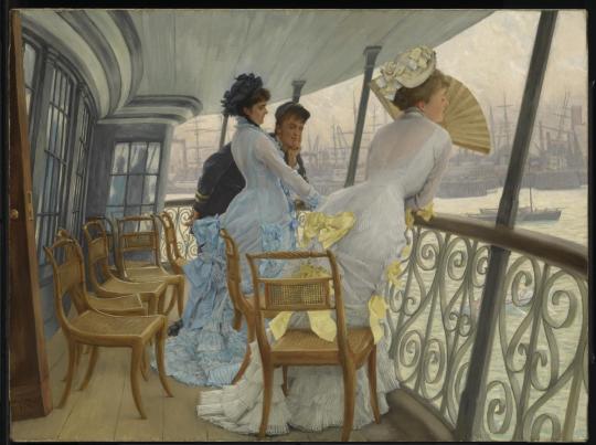
A point in case is The Gallery of H.M.S. Calcutta. The painting depicts a young naval officer and two women on the stern balcony of a navy training ship, entangled in what appears to be a love triangle. The woman on the right hides her face, and thus her left ear, behind a fan, possibly asking the young man, in Victorian fan language, not to betray her secret. The shadow on the window panes in the back of the painting, in the meantime, suggests the man’s closeness to the other woman. The conspicuous heart shapes discernible in the metal railing fencing off the balcony leave little doubt about what is going on.
James Tissot, 1876, The Gallery of H.M.S. Calcutta
Tissot’s choice to locate his scene on this particular ship, moored in Portsmouth dockyard at the time, and to include the ship’s name in the title, can hardly be accidental. It has been suggested that he used the
name of the ship as a pun, giving an unexpected twist to the meaning of the painting. ‘Calcutta’ would then refer to the French ‘Quel cul t’as’, or ‘what an ass you have’, and would thus direct our attention not so much to the stern of the ship as to that of the woman on the right, whose languid pose and hourglass figure are echoed in the ship’s undulating forms and simultaneously mirrored by the shape of the chairs on the balcony.
The author Henry James called the painting banal and vulgar, but Tissot’s joke seems less rude once we realise that it does not just make fun of the woman but is also made at the expense of the young officer, whose mind we may be reading in the phrase ‘Quel cul t’as’, or even at the expense of
ourselves, who may have been thinking the same thing before suddenly grasping Tissot’s play on words. The joke can also be seen as a satirical comment on the excesses of contemporary fashion, for the woman is probably wearing a dress with a so-called culde Paris, a padded undergarment designed to emphasise the back of the dress (and thus the woman’s backside). Finally, the combination of ‘Quel cul t’as’ with ‘H.M.S.’, or ‘Her Majesty’s Ship’, may even be read as a disrespectful nod to the Queen.
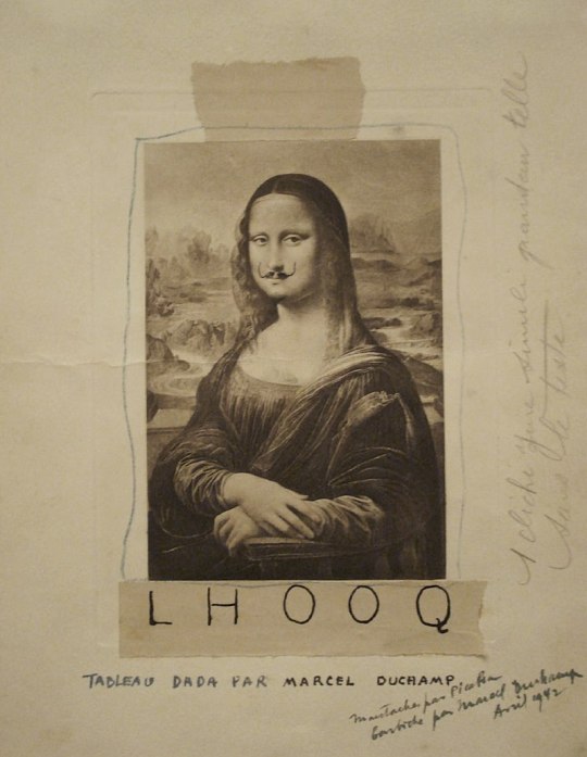
Tissot’s joke, whether we appreciate it or not, comes strikingly close to the pun in Marcel Duchamp’s much more famous L.H.O.O.Q. of 1919. This work is a simple photographic reproduction of the Mona Lisa to which Duchamp added a moustache and five letters. When spelled out in full, in French, the letters read as ‘elle a chaud au cul’ or ‘she has a hot ass’, the underlying suggestion being that this observation may explain the Mona Lisa’s mysterious smile.
Marcel Duchamp, 1919, L.H.O.O.Q.
Duchamp’s iconoclast gesture questions the western art historical canon and even the very concept of art in ways that Tissot would never have thought possible – or permissible for that matter – but his pun is crude in comparison with Tissot’s more ambiguous double entendre. There are many ways in which Tissot is the more conservative artist and person of the pair, but his sense of humour seems at least as advanced and sophisticated as Duchamp’s. An unbiased reassessment of his art, made possible by the exhibitions in San Francisco and Paris, seems only fair.
Read more in:
– Nancy Rose Marshall and Malcolm Warner, James Tissot: Victorian Life/Modern Love, New Haven & London: Yale University Press, 1999.
– Melissa Buron (ed.), James Tissot: Fashion and Faith, exhibition catalogue, San Francisco: Fine Arts Museums of San Franscisco and Paris: Musée d’Orsay, Munich: Prestel, 2019.
A couple of weeks ago, I had the good fortune of spending two days in the city of light. Following professional as well as personal inclinations, I visited three exhibitions, which were strikingly different in size, organization, and
ambition – different to such an extent, indeed, that only the chilly and surly
demeanor of the porters at the entrance reminded me of their shared setting in Paris. In the following remarks, I would like to briefly reflect on these exhibitions so as to ponder the ways in which exhibitions shape our understanding of art, often in paradoxical ways.
The first exhibition was ‘Resolutely Modern’, an absolutely massive
retrospective of the French avant-garde painter Henri de Toulouse-Lautrec.
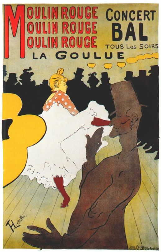
Toulouse-Lautrec’s depictions of theatres and dancers in Montmartre have become iconic; his turn to posters as a medium for his art was revolutionary. Consider, for instance, La Goulue, a poster that ison display at this exhibition in the various stages of the printing process. The exhibition explores the many intersections between Toulouse-Lautrec’s work and that of his contemporaries. In the very first space, for instance, his work is compared to that of his teacher, Fernand Cormon, a historical painter. Seeing Cormon’s tableaux, the viewer is faced with a view of history that is marked not by the progress of civilization but by barbarity. This notion illuminates the art of Toulouse-Lautrec, in which supposedly civilized life is stripped of its veneer, so as to show the animality that lurks beneath. More recognizable points of reference, such as Degas and van Gogh, are present as well. Like these artists, Toulouse-Lautrec is one of the painters of modern urban life, and its seedy side in particular; his art has been pigeonholed as decadent or, less charitably, degenerate – a view that was reinforced by his physical disability and his bohemian lifestyle (at the exhibition, one learns that Toulouse-Lautrec sometimes stayed in brothels for weeks on end). As such, Toulouse-Lautrec’s work questions the distinction between high art (culture for the elite) and low art (culture for mass-consumption) that was so characteristic of his own time.
On the one hand, his works did not result in financial gain, but were
appreciated an bought by people belonging to his inner circle. On the other
hand, he took ‘vulgar’ culture as his subject, which may lead one to infer that his works were meant as an appeal to popular taste. In other words, Toulouse-Lautrec tried to have his cake and eat it. Yet, in the long run, his approach was successful, as this exhibition shows: a huge portion of his work is now displayed in the Grand Palais, a cultural epicentre, in an exhibition that spans three floors. The exhibition is so vast that as one proceeds, one begins to believe that it will never end. The story that the exhibition tells, then, is different from the effect that it achieves: while the exhibition explores the local and particular qualities of this marginal artist, it at the same time sanctifies this art as being of universal and everlasting value. My own feeling, on leaving the exhibition, was that, perhaps, Toulouse-Lautrec’s work was too popular, too vulgar, and that this
excessive vulgarity (which I here use in the qualitative and not the evaluative sense of the word) was what has made these works so prestigious in the long run.
The second exhibition was suffused with a more intimate atmosphere. I first discovered the wonderful Musée Jacquemart André in 2013, when my interest in Victorian literature led me to the museum’s exhibition of Victorian art, Désirs & volupté à l’époque victorienne. This exhibition showcased works from private collection of Pérez Simón. The exhibition that I saw this year featured works from another private collection, that of Alvaro Saieh and Ana Guzmán, ‘one of the most precious and little-known private collections of Renaissance art in the world’, as the booklet informs us. Unlike the monumental scale of the Toulouse-Lautrec exhibition at the Grand Palais, which mostly consists of works that are in public hands,
and which promises to give the audience an overview, the exhibitions at Musée Jacquemart André appeal to a more select audience, composed of connoisseurs who already have such an overview, and who will be able to appreciate these private collections without the help of a framework. In the case of Désirs & Volupté, I managed to find my way, which was partly due to the fact that as a Victorianist I could place the paintings I saw. In the case of The Alana Collection: Masterpieces of Italian Painting, however, I was lost.
And this was unexpected, for there is a strong synergy between the exhibition and the museum’s permanent collection, which has a focus on medieaval and early modern works of art: an introductory film nicely highlights the many echoes that are thus created. No, I think I felt lost not because of my inability to understand the works in themselves, but because of their presentation. The exhibition’s title already points to nature of the problem: whereas in the case of Désirs & Volupté the name of the
collector was willing to share his collection with the wider public was hidden in the text itself, in the case of The Alana Collection, their names were emphatically present. The exhibition is in many ways a tribute to their willingness to share their works with the wider public. The first room of the exhibition tries to replicate the benefactors’ living room, where their paintings vie for space. While the effort is an interesting one, its purpose is all too obvious, and the result makes it difficult to examine and scrutinize the actual works. Even more, the exhibition even features a rather hastily taken photograph of their living quarters, so that viewers can fully appreciate these works’ contemporary location.
The first room of the exhibition, replicating the benefactors’ living room
The benefactors’ actual living room
As a result, the actual paintings get short shrift, even though these are magnificent. What the visitor remembers is the name of the collectors, but perhaps not in the way that the collectors envisioned. This is not meant as a jibe: without the efforts of private collectors such as Alvaro Saieh and Ana Guzmán, the art world would not be able to function in the way that it does, and it is their good right to ask that their willingness to share their passion with the world be acknowledged and recognized. What I want to highlight is another paradoxical effect: if one so openly asks for recognition, as in the present exhibition, the opposite effect is achieved. To be truly successful, an exhibition should let the collection speak for itself; only thus will the interested viewer fully appreciate the care that the collectors have taken, and be willing to recognize as benefactors, in the full sense of the word. I am aware of the irony that, of course, by addressing this issue, I have paid the collectors the compliment of talking about them rather than their collection.
The third exhibition which I saw replicated a similar dynamic on an international stage. The musée du Luxembourg, which lies adjacent to the French senate, features an exhibition with masterpieces from ‘The golden age of British painting: from Reynolds to Turner’. These works are on loan from Tate Britain. By allowing a select choice of works to travel to the heart of France, British art is given an ambassadorial function. It is paradoxical to encounter these British masterpieces in a French setting, but the effect is salutary one. The curators have created a fine and interesting narrative, one which manages to sustain the viewer’s interest, which is difficult to maintain when one is submerged in the halls of their home, as in the exhibition on Toulouse-Lautrec. As a result, this exhibition sheds some new, fresh light on works that viewers thought they already knew. One particular surprise, for me, was the inclusion of John Martin’s The Destruction of Pompeii and Herculaneum (1822), which is the final painting, to be seen when one leaves the exhibition. I will readily confess that I did not know this work. Martin’s work has only quite recently been revalued: while
his sublime historical tableaux were very popular in the early nineteenth
century, his work was considered too dramatic and excessive for Victorian
tastes. But it was not the innate qualities of this painting that struck me;
nor was I reminded of the nineteenth-century preoccupation with antiquity,
which is one of my own research interests. The first thing that came to mind – my mind, at least – was the album cover of ‘Sweet Apocalypse’, a beautiful
collection of haunting melodies by the contemporary German pianist Lambert, who always performs while wearing a Sardinian mask. This album’s cover is a painting by Mioke and shows the musician walking with a child towards an eruption of light, whose source remains unknown (but given the album’s title, it appears most sinister).
The Destruction of Pompeii and Herculaneum
Albumcover Sweet Apocalypse
There is of course a striking difference: whereas in Martin’s painting the citizens of Pompeii attempt to flee the apocalypse behind them, in
Mioke’s painting two individuals calmly walk towards it. (Incidentally, Mioke’s creation of the painting can be reviewed here). At the end of this wonderful exhibition in the musée du Luxembourg, then, with the crème-de-la-crème of British painting behind me, I saw an artwork by a (for me) unknown artist, which made me think of the painting of the cover of an album by a pianist who performs anonymously, but whose music thus, paradoxically, is reaching an ever-growing audience. Whether Lambert and Mioke are consciously referring to Martin’s painting, I cannot say; intertextuality may work in mysterious ways, as theorists such as Julia Kristeva and Roland Barthes have shown. What I can say, is that in our times anonymity may be a better guarantee for creating
forms of imaginative engagement.
Now, designer Marlon McKenney has published Alice in Wonderland: Re-Mixed.
The book is a drastically shortened, retold version of the classic story, richly illustrated with digital images. These illustrations do an excellent job at normalising the depiction of brown-skinned people in picture books: exactly as I wished for when I made my call last year.
The book also includes some nice finds in the genre (yes!) of Alice art: there is a water-clock tea set; the Cheshire Cat practices voodoo; the White Rabbit is a DJ carrying a bling-bling watch; the game of croquet has been turned into a singing contest; and the Queen of Hearts’s children have been turned into – white – security guards, carrying guns, batons and tasers: ominous, but no less ominous than Carroll’s original.
The special aim of this publication is to bring African American children in touch with African American heritage.* The book thus aims to help consolidate a canon of art works and ideas created by people with African roots. Or, as it seems in some parts of the book, the aim may even be to create a canon of non-whites from across the entire world.
Unfortunately, this has resulted in a book with a didactic tone and little humour. During Alice’s long fall down, for instance,
‘She saw mystical books, ancient symbols, and pictures of important historical women. Alice was dazed and confused by the images circulating through her mind, yet somehow, they felt vaguely familiar. She’d have to remember to ask her sister about them.’ [bolds in the original]
At the end of the story, ‘everyone from Wonderland finally decided to stand up to the Queen and stop her from hurting anyone else anymore.’ And after Alice’s return above ground, she says to her sister: ‘I’m just glad to be back where things are really what they seem[.]’ What chafes most in this
respect, is that Lewis Carroll’s intentions and methods – to entertain children with nonsensical conversation – have been lost. And perhaps this is inevitable. The makers of the book clearly thought: what better way to
strengthen a new canon than to attach it to an existing canonic work?
But in many ways, the original Alice is an anti-canonic work. Irreverence, critique and irony are at its very heart: Shakespeare is reduced to a textbook portrait of a man with a finger pressed against his forehead; the Battle of Hastings, focal point in the British self-image, is the driest story a crowd of animals can come up with; there are the ineffectual King and Queen of Hearts; haughty Humpty Dumpty falls off his wall; and afternoon tea is a never-ending affair. Every bit of British canonicity is ridiculed.
To create a similar, humorous critique of African American figureheads might, Marlon McKenney may have deliberated, undermine the purpose of his book, which was to offer its readers a first introduction to these people and make it unambiguously clear that they are our heroes. In a typical sentence therefore, Alice’s sister Kenya ‘was reading aloud from one of her favorite books by the great poet Maya Angelou.’
On the other hand, the Re-Mixed retelling also offers a refreshing take on the idea of a canon by mixing up what in books is usually demarcated as two separate realms: that of low culture and of high culture – of street art and salon art: Tweedledee and Tweedledum figure as two breakdancers on cardboard, next to the novels of Maya Angelou; vodou stands next to the high politics of Nelson Mandela.
Refreshing, but also a little risky. Because by following this tactic, and by including icons from across the history of the world, ranging from the Bhagavad Gita, via shamans, Frida Kahlo, and a southern-Asian caterpillar, to Queen Nefertari, all in a text of only a few thousand words, McKenney runs the danger of creating the impression that African American history offers little material that is worthy of a cultural canon. It is as if he only had a few people and works of art to choose from. Granted, every canon-building endeavour has to start somewhere. But by limiting himself to, for instance, twentieth-century North America, the author would have made a much stronger case for the global significance and influence of African American culture.
And perhaps the best service McKenney could indeed have done his heroes, would have been to treat them with a little less reverence. (Okay, apart from Maya Angelou. But Haile Selassie?) Because: once we can laugh with our cultural icons, we know that they have undeniably made it to the canon.
* This is my interpretation of the publisher’s blurb, which reads:
‘CCP is an independent publishing company committed to creating a platform for diverse content that push the boundaries of traditional storytelling. Through the creation of narratives that are a reflection of the people both creating and experiencing these stories, we empower young readers to reach their fullest potential while embracing their history and culture.
Our stories are a reflection of the global community and we believe it is important that young people of color not only see themselves reflected in stories but also have a platform to provide their own authentic voice, culture, and experience. Storytelling is an extraordinary way to educate and empower young readers and show them that they are limitless.’
Één van cinema’s vele scheppingsmythen wijst op de vertoning van Louis Lumière’s Le Repas de Bébé (1895), een korte film waarin niets meer te zien is dan hoe een baby gevoed wordt in een zonovergoten tuin. Ook al portretteerde de film slechts een futiel alledaags ritueel, haar bezoekers waren verbijsterd door het nieuwe medium. Het meest fascinerende en raadselachtige aspect van het fragment, zo beschreef film theoreticus Siegfried Kracauer in The Theory of Film, was niet de familie die zich op de voorgrond verzamelde, maar de poëzie van de wind die de bladeren in de bomen deed dansen in de achtergrond.
Wie deze cine-ecologische genealogie verder volgt, komt ongetwijfeld snel uit bij de Russische filmmaker Andrej Tarkovski, wiens cinema van stil kabbelend water en diepzwarte aarde vele regisseurs na hem — onder andere Denis Villeneuve, Lars von Trier en Michael Haneke — heeft begeesterd. “De ultieme Tarkovskiaanse spirituele ervaring,” zo schrijft filosoof Slavoj Žižek in The Thing from Inner Space, “doet zich voor wanneer een karakter ligt uitgestrekt op het aardoppervlak, half ondergedompeld in gortig water”. Tarkovski kijkt niet omhoog naar de hemel om het spirituele en het transcendente te vinden, maar naar beneden; naar de modder, de smurrie, en de fijne stofdeeltjes die zweven boven het aardoppervlak: zijn cinema is er een van rauwe materie, van down-to-earth immanentie.
Tarkovski’s werelden zijn vochtig en drassig, vaak verwoest en vervallen, bedekt door een deken van mist. Als nomaden zwerven zijn karakters door zulke gebieden, nooit goed wetend waar de reis naar toe gaat of waar zij zullen eindigen, altijd onderweg naar het onbekende. Voor wie zich waagt aan het werk van Gilles Deleuze en Félix Guattari weet dat de “nomade”, zowel als denkfiguur en metafoor, haaks staat op het klassieke denken over de mens en haar plaats in de wereld. Zij is niet, zoals vaak gesuggereerd, onveranderlijk thuis in het centrum van het universum, maar voortdurend in wording, voortdurend in transformatie. Ontheemd deint zij mee op de golven van het zijn, schommelend en beweeglijk, in een dynamisch
proces van worden. De mens is, net zoals de personages in Tarkovski’s
films, eeuwig onderweg.
Het is dit beeld van het rondreizende individu in een wereld van afval en aftakeling dat richting kan bieden in ons denken over het Antropoceen, het tijdperk waarin de uitzonderlijke en collectieve invloed van de mens op mondiale en catastrofale schaal zichtbaar wordt.
In Stalker (1979), een film gemaakt tijdens grote nucleaire dreiging, situeert Tarkovski de mens-als-nomade het meest expliciet in haar materiële en vervuilde omgeving. In de film banen een schrijver en een professor zich een weg door het verboden en haast ondoordringbare landschap van ‘de zone’. Zij worden begeleid door de stalker, een figuur die zijn leven op het spel zet — tegen betaling uiteraard — om de twee nieuwsgierigen rond te leiden door het verontreinigde gebied. De drie karakters dwalen door de zone in de hoop het gebied te doorgronden, maar stuiten enkel op nog meer raadsels. Ook voor de kijker is de zone gehuld in mysterie, zo weet zij niet hoe en wanneer deze giftige plek ontstaan is of hoe lang deze nog zal bestaan. Het is al te laat om de zorgelijke ontwikkelingen in de zone te stoppen, maar te vroeg om met enige helderheid de situatie te begrijpen. Het is door deze ambiguïteit en ongrijpbaarheid dat Tarkovski’s zone
uitnodigt om te denken over het Antropoceen als een esthetisch probleem: hoe kunnen de kunsten een tragedie vatten die zowel onmenselijk rampzalig als grotendeels vormloos is, onontkomelijk aanwezig maar niet onmiddellijk zichtbaar?
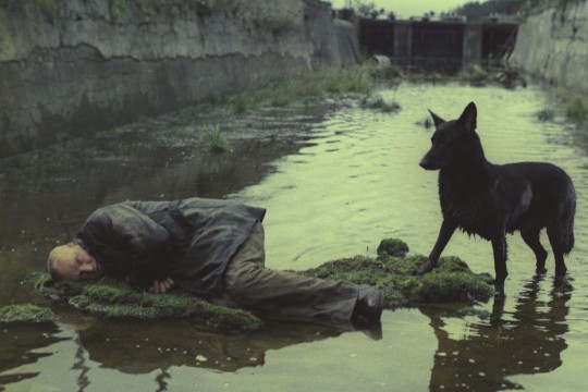
Halverwege de film, wanneer de drie mannen hun rust vinden op een drassig stuk grond, lijkt de film een antwoord te formuleren op deze vraag. Nadat de stalker zijn ogen heeft gesloten, snijdt de film naar een ‘overhead
shot’van de rivier die tussen hen in stroomt. De camera glijdt vanaf een paar centimeter langzaam over het wateroppervlak. Eerst bewegen we over het slapende gezicht van de stalker, waarna we een aantal willekeurige
objecten tegenkomen, roestig en half begraven in de zanderige rivierbedding. Veel van deze troep is niet meer thuis te brengen, te aangetast door het verontreinigde water, maar een aantal menselijke relikwieën, zoals munten, foto’s, spiegels, en spuiten, zijn nog te herkennen. Ondertussen horen we in een voice-over hoe de vrouw van de stalker een passage voordraagt uit de Openbaring van Johannes, waardoor de onorthodoxe camerabeweging een merkwaardig apocalyptische connotatie krijgt.
Tarkovski’s focus op de wederzijdse verwikkeling van menselijke en niet-menselijke materie herinnert ons aan het gegeven dat onze natuurlijke omgeving meer is dan de passieve achtergrond van ons bestaan, niet enkel gereserveerd voor het anthropos. Mens en natuur, zo lijkt hij te suggereren, zijn deel van een gemeenschappelijk milieu en relationele ecologie, gemaakt van eenzelfde materie en in eenzelfde staat van ontbinding. Het is een opvallend lange scene zonder narratieve context, waarin een langzaam proces van verval en sedimentatie zich voor onze ogen lijkt te voltrekken. Het is het soort traagheid dat Tarkovski leent van de door hem bewonderde Michelangelo Antonioni, wiens films gekenmerkt worden door geruïneerde landschappen en loze tijd. Deze lege tijd, beroofd van enige narratieve significantie of menselijke actie, zorgt ervoor dat karakters en hun
omgevingen gelijkgesteld worden aan elkaar. Voor even staat niets in dienst van het plot. Wat overblijft, zoals ook Žižek beschrijft, is enkel de fysieke impact van materiële texturen.
Naast shots waarin de camera nomadisch over aardse oppervlakten beweegt, decentreert Tarkovski zijn personages ook op andere wijzen. De eerste minuten van Solaris (1972), bijvoorbeeld, worden gekenmerkt door lange close-ups van bewegend riet en zeewier, waarna de camera langzaam het hoofdpersonage introduceert. We zien psycholoog en kosmonaut Kris Kelvin, wiens blauwe jas haast wegvalt in de nevelige achtergrond. Het is een techniek die Tarkovski inzet om zijn personages expliciet te laten versmelten met de natuurlijke landschappen in zijn composities, waarbij de oppositie tussen voorgrond en achtergrond verdwijnt.
Still uit Solaris (Tarkvoski, 1972)
Still uit Stalker (Tarkovski, 1979)
Still uit Andrei Rublev (Tarkovski, 1966)
Op verschillende manieren lijkt Tarkovski de aandacht te vestigen op de aarde als een vitaal en gedeeld milieu, als een monistisch geheel dat van strikte hiërarchieën is ontdaan. Zoals Karen Barad schrijft in haar artikel ‘Posthumanist Performativity,’ “de mens is niet simpel gelokaliseerd ergens in de wereld, maar maakt deel uit van de wereld in haar voortdurende intra-activiteit”. Als zijn karakters zwijgen, laat Tarkovski hun natuurlijke omgeving spreken. Als we bereid zijn te luisteren, horen we het stromen van water en de wind in de bladeren.
Tarkovski’s oeuvre is dit najaar te bewonderen in verschillende filmhuizen en bioscopen door Nederland. De tentoonstelling ‘Andrei Tarkovsky – The Exhibition’ is nog tot 6 december 2019 te zien in Eye Filmmuseum Amsterdam.
Weg met het korset De viering van honderd jaar vrouwenkiesrecht roept de vraag op wat feminisme met mode heeft te maken. Als we foto’s bekijken van suffragettes uit de eerste feministische golf, aan het einde van de negentiende eeuw, dan zien we strijdbare vrouwen in chique gewaden: lange rokken, geborduurde japonnen, en opgestoken haar onder hoeden
met veren. Deze deftige dames streden voor het recht om te stemmen, maar wilden ook andere belangrijke doelen bereiken zoals toegang tot de universiteit, betaald werk en geboortebeperking.
Verrassend genoeg richtte de vrouwenemancipatie zich ook op een alledaags onderwerp als kleding: ze verlangden gezonde kleding voor vrouwen! Weg met het korset, riepen de feministen. Het korset drukt de buik in en bolt de borsten op, zodat de lijnen van het vrouwelijk lichaam figuur benadrukt worden. Sexy misschien, zoals je nu kan zien in shows
van Dita Von Teese of Madonna. Maar als je zoals in vorige eeuwen dagelijks
strak ingesnoerd bent in een korset, kan je buikpijn krijgen of moeite met
ademhalen. Niet voor niets vielen vrouwen rond de vorige eeuwwisseling zo vaak flauw: ze kregen gewoon niet genoeg adem door het strakke korset. In historische kostuumfilms is vaak een scène te zien waarin de vrouwelijke hoofdpersoon stijf in het korset wordt geregen als symbool voor de onderdrukte positie waarin zij zit; bijvoorbeeld Rose (Kate Winslet) in Titanic (1997). Voorvechters van vrouwenemancipatie vonden het korset dan ook een slechte zaak en pleitten voor soepele kleding om vrouwen letterlijk meer bewegingsvrijheid te geven.
Kom maar op met die broek Aan het begin van de twintigste eeuw wordt vrouwenkleding in rap tempo moderner: het korset verdwijnt, de rokken en de mouwen worden korter, het silhouet wordt rechter en de lijnen simpeler. Vrouwenemancipatie speelt hierin een belangrijke rol: als vrouwen de arbeidsmarkt gaan betreden en de tram of trein willen halen, dan zijn lange en volle rokken bijzonder onhandig en zelfs gevaarlijk. Modeontwerpster Coco Chanel maakt korte metten met het korset, het voluptueuze silhouet en de
tierlantijnen van welgestelde dameskleding. Zij kleedt vrouwen in een simpele rechte rok tot op de knie en een recht jasje van soepele stoffen, zoals jersey, wat oorspronkelijk een stof is voor mannenondergoed. Ze introduceert zelfs de broek voor vrouwen. En dat is revolutionair!
Het is voor ons nauwelijks te bevatten, maar het was voor vrouwen bij wet verboden om broeken te dragen. Aan het einde van de negentiende eeuw trekken enkele vrouwen voor het eerst een broek aan—en prompt worden ze gearresteerd. Broek-dragende vrouwen overtreden immers de openbare orde of Gods orde. In de jaren twintig van de vorige eeuw begint, heel langzaam, de pantalon voor vrouwen op te komen. Beroemde actrices zoals Marlene Dietrich of Greta Garbo zijn afgebeeld in pantalon en zelfs in mannenpak. Maar pas in de jaren zestig breekt de damesbroek definitief door; nog maar vijftig jaar geleden. De modeontwerper Yves St. Laurent schrijft in 1966 geschiedenis met zijn smoking voor vrouwen. En dan gaat het snel. Door de hippiebeweging vervagen de grenzen tussen mannen en
vrouwen: jongens dragen lang haar en meisjes dragen jeans. In de jaren tachtig verschijnt de carrièrevrouw in mannenpak: een colbert met volle schouders, soms met broek, soms met een rok. Het wordt ook wel ‘power dressing’ genoemd; bijvoorbeeld Diane Keaton in de film Annie Hall (1977) of Grace Jones met haar vierkante schouders en dito kapsel (b.v. het album Nightclubbing, 1981).
Een rok voor mannen: een brug te ver?
Feminisme gaat dus niet alleen over kiesrecht, arbeid, of het slikken van de Pil, maar ook over het soort kleding dat we dragen. De broek werd al genoemd, maar er was in de jaren zestig ook strijd over sexy kleding, zoals de komst van de bikini of de minirok, en over het korte kapsel. Telkens weer moesten vrouwen hun vrijheid bevechten. En dat is gelukt: vandaag de dag zijn we heel vrij in de keuze van onze looks.
Toch is hier nog iets interessant aan de hand: want vrouwen mogen dan broeken dragen, maar mannen dragen zelden rokken of jurken. En al helemaal niet in de politiek! Zie je het al voor je: Mark Rutte (of Trump!) in een rok? Nee dus. Ze zijn er wel, rokkendragende mannen, maar alleen op de catwalk, in ontwerpen van Marc Jacobs, Jean-Paul Gaultier, of J.W. Anderson.
Aan de hand van gendertheorie kunnen we uitleggen dat het verschil in kleding tussen mannen en vrouwen in feite een machtsverschil is. Een sociale groep zal zich altijd aanpassen aan de dominante norm en daarmee aan macht en status winnen. Als de achtergestelde sociale groep van vrouwen zich aanpast aan de heersende norm van mannen, trekken vrouwen mannelijke kleding aan, zoals de pantalon of het colbert. Zo verkrijgen ze meer macht en status. Daarom zie je dat vrouwen aan de top, zoals in de politiek, zo vaak een broekpak dragen: ze passen zich aan de mannelijke norm aan. Als de dominante groep, de mannen, kleding overneemt van de maatschappelijk achtergestelde groep, de vrouwen, dan verliest die groep aan macht en status. Daarom vinden we een man in een rok of jurk raar of belachelijk. Hetzelfde geldt voor felle kleuren. Een man in een knalrood colbertpak nemen we minder serieus, want kleuren zijn vrouwelijk in de westerse cultuur van vandaag. Vandaar dat Angela Merkel, Hillary Clinton en menig andere vrouwelijke politicus met een felle kleurkeuze toch nog een vrouwelijk accent geven aan hun mannelijke colbert of broek.
Bij dit soort machtsverschillen is het altijd aardig om je de situatie omgekeerd voor te stellen. Bekijk bijvoorbeeld de fotoserie van Gigi Hadid en Zayn Malik voor de Vogue van augustus 2017, waarin ze onder andere in hetzelfde bruine Pradapak poseren. Dat accepteren we: Gigi kan ‘ongestraft’ mannenkleding aantrekken. Zayn en Gigi bepleiten ‘gender fluidity’ in hun kleding, waarmee ze aangeven met vrouwelijkheid en mannelijkheid te willen spelen. Inderdaad draagt Zayn kleding in felle kleuren, met bloemenpatronen en zelfs met kant, maar een rok of jurk draagt hij niet. Natuurlijk is in de populaire cultuur meer vrijheid dan in de wereld van de politiek: een model, zanger, acteur of danser kan nog ’ns spelen met zijn kleding, maar een mannelijke politicus in een rok, jurk of zelfs maar
een rood, geel of paars colbertpak—dat is echt een brug te ver.
Genderbende Vanaf de jaren zestig is er ook een andere ontwikkeling gaande, want mannen- en vrouwenkleding komt dichter bij elkaar ondanks de nog bestaande verschillen. Androgynie is een ideaal dat steeds opnieuw terugkeert. In de jaren zestig en zeventig heette dat ‘uniseks’ kleding. In de jaren tachtig vierden de vrolijke ‘gender benders’ in de popmuziek hoogtij: David Bowie, Prince, Michael Jackson, Boy George, en onder de vrouwen Madonna, Grace Jones en Annie Lennox. Ook de laatste jaren is er in de mode weer volop aandacht voor ‘gender fluidity’; een meer flexibele grens
tussen de seksen in plaats van een harde scheidslijn. Dit zagen we al bij Gigi en Zayn. Al eerder poseerde het Australische model Andrej Pejić als (toen nog) man voor dameskleding van de HEMA, en was de Nederlandse Saskia de Brauw het model in een mannencampagne voor Yves Saint Laurent (2013). En de Nederlandse eeneiige tweeling, de zussen Lisa en Anna Bosveld, willen zich aan genderhokjes onttrekken. Op het gebied van kleding (laat staan make-up!) is de vrijheid voor mannen veel kleiner dan voor vrouwen. Voor mannen valt er dus nog een wereld te winnen wat kleding betreft. Kom maar op met die kleurige bloemenpatronen in fluweel, brokaat, of kant in mannenkleding. En wie weet: zelfs een zwierige rok of jurk voor de heren?
Van het korset zijn we al ruim een eeuw af; de broek mogen vrouwen al meer dan een halve eeuw aan; nu kunnen we er in het nieuwe millennium met elkaar een ‘genderbende’ van maken!
4:30 AM. While my 5-month-old daughter is still asleep, I go downstairs to do my daily meditation and yoga practice before she wakes up. Since three years or so, I practice Ashtanga Yoga, a dynamic sequence of postures characterized by a synchronization of breath and movement. This style of yoga originates from the Indian southwestern city Mysore, where Sri K. Patthabhi Jois (1915-2009) founded the Ashtanga Yoga Research Institute in 1948. In Ashtanga Yoga, ‘Mysore’ refers to the way it was originally taught by Patthabi Jois. Whereas most yoga nowadays is taught collectively in led-classes with teachers indicating the pace, Mysore style Ashtanga Yoga is practised individually and taught one-on-one within a group setting.
When I first set foot in a Mysore room early one morning, I was struck by the electricity in the air. People breathing like Darth Vader (called ‘ujjayi
breath’). Sweat dripping from strong, supple bodies. Energetic, flowing
movements. Initially, I was primarily drawn to the physical aspects of the
practice. I felt that there was something poetic about folding your body into a variety of geometrical shapes. As I continued to practice, my interest in
yoga’s cultural roots grew. Obviously, I knew that yoga was more than just a
physical workout, but the exact nature and history of this spiritual tradition
were largely unknown to me. I started reading some of the classical yoga texts, such as the Yoga Sūtras of Patañjali (400 CE), and delved into yoga
scholarship. I learned the Sanskrit words of the Ashtanga Yoga chants by heart. Meditation gradually became a more important part of my practice. But as I emerged myself into the history and customs of this tradition, a feeling of unease started to grow upon me.
This is why. Modern yoga as practised in the West is an obvious example of cultural appropriation, in the sense that elements from a minority culture are adopted by the dominant culture and transformed into something differently. The rationale is this:
– Yoga is a spiritual tradition originating from India
– People from India are minorities in Western countries, and
India has a history of colonization by Westerners
– In the West, the term ‘yoga’ now denotes something that is
different from its original meaning and uses
To be clear, I am definitely not the first to point this out. Especially in light
of India’s colonial history, it is striking to see that this spiritual tradition is now subject to modern forms of colonization and appropriation. It is thus not strange that India has uttered the wish to reclaim yoga.
Still, practising yoga as a Westerner, or as someone who does not have Indian roots, does not necessarily make you a bad person. As most cultural phenomena, yoga is not a stable, fixed practice, it is in constant flux and has witnessed many transformations over the centuries – arguably, the recent Westernization of yoga is just one of those changes. However, I think that yoga practitioners do have a moral obligation to be aware of the the way yoga has changed as a result of its appropriation by Westerners. To help raise such awareness, I will outline one of yoga’s transformations that took place during its rise in the West.
Most people nowadays associate yoga with physical postures on a mat. This association is, however, something fairly recent. As scholars James Mallinson and Mark Singleton describe in Roots of yoga (2017), most ancient writings on yoga instruct students in a multifaceted system of which physical postures is just one of several ‘limbs’. These range from fourfold to fifteenfold systems. Ashtanga Yoga, for instance, is based on an eightfold system as described in one of the most well known yoga texts, the Yoga Sūtras of Patañjali (400 CE). The first two limbs – niyama and yama
relate to behaviour towards oneself and others, such as discipline (tapas) and non-violence (ahimsa). These limbs bear similarities to the moral codes prescribed in various religious strands, such as the Christian ten commandments. Postures (asana) is the only limb referring to the physical postures that most people associate yoga with today. Interestingly, the Yoga Sūtras do not contain any instructions about how to do a headstand or to how put your leg behind your head, asana simply refers to a ‘steady and
comfortable’ seated position. This seated position is perfect for working on
the other limbs such as breath-control (pranayama), sense withdrawal (pratyahara), focus (dharana), and meditation (dhyana). Finally, the goal of all of this is to reach a state of samadhi, commonly defined as union, absorption, or enlightenment.
Physical postures are just one element of yoga. Although later yoga texts such as the Hatha Yoga Pradipika (1500 CE) describe more complex postures than just the seated position described in the Yoga Sūtras, it is clear that the focus on the physical aspect of yoga only came into being in the twentieth century. In most Western countries, yoga today seems to exclusively refer to asana, and is commonly considered as just one of many physical workout routines, which is exemplified by the fact that fitness studios and sport centres often provide yoga classes (also at Radboud Sports Centre). The clearest example of modern-day Western yoga’s
prioritization of the physical aspect is the existence of yoga championships, where ‘yoga athletes’ are judged merely on the physical appearance of the postures.
The physical aspect of yoga drew me to the practice in the first place, and this is probably also what attracts other (Western) practitioners to it. I primarily saw it as workout, used it to train my body, and it gradually replaced my long distance runs and fitness sessions. Was I doing yoga, or was I just doing some stretching exercises? Probably the latter. But although I was not fully aware of the importance of the other limbs of yoga, breath-control (pranayama), sense withdrawal (pratyahara), focus (dharana), and meditation (dhyana) started to become equally important aspects of my daily practice. Do I now have the right to say that I am doing yoga? I am not sure. There is a huge gray area between cultural appropriation and cultural appreciation. Who draws the line, and where should the line be drawn?


_1891.jpg)